AI can build a page very fast. That's useful, but it also creates a common problem: the first result often looks "good enough" in the same way most AI pages look good enough. This article is for those who want to push past it.
- In this issue
- I.
- Getting your desired style right
- II.
- Creating the next sections
- III.
- Orchestrating animations & effects
- IV.
- Final polish
The way we generally work with Onepage AI can be formulated in a single sentence:
Focus on one part of the work at a time.
Here is one of the key takeaways of many thousand hours of working with LLMs in terms of pages : all of us are getting very similar results. Standing out with AI-generated pages is hard, because LLMs have a bias: a limited pool of knowledge about styles and layouts, pushing us toward available angles.
And there is nothing wrong with general styles unless you are trying to create something you really like.
So let's see what "general" prompt output from LLMs really looks like.
One of these styles an LLM will create for you if you ask it to make a "nice", "awesome", "polished" or any other adjective of "superior" quality page.
Many people think that by adding one of those adjective it will get an LLM to "think" in a more creative direction while in fact it actually narrows down the range of styles it can potentially produce (mostly to the 3 mentioned above)
They look cool, but in this article let's talk about how to push the LLM toward your own desired style.
Getting your desired style right
I start with a visual reference.
Sometimes I find a page online.
Sometimes I generate a rough full-page concept with GPT Image.
The reference does not need to be perfect or high resolution. What matters is that it has a distinct look: the colors, the buttons, the frames, the shadows, the type of background, the feeling of the surfaces.
And it has to be something you weren't able to get out of AI easily with simple prompts.
Two valid starting points. A found page on the left, an AI-generated mood concept on the right.
Then I upload that reference into Onepage AI and ask it to do only one thing: recreate the visual style.
After the first result, I check only the style without worrying too much about whether the layout is good yet. I look at the materials, the buttons, frames, hover effects, and the general mood, and I'm trying to spot the weaknesses.
“A bit of positive reinforcement with acknowledging a great start”
This step may take a few tries. That is normal. AI will not get it right on the first go, so 2–3 more prompts are required to get it right. The goal is to create one strong section, usually the hero, that becomes the style base for the rest of the page.
Once the style feels right, I switch to layout. This is a separate step. I ask the AI to keep the style and focus only on composition: spacing, alignment, density, hierarchy, and the position of elements.
This separation makes the process much easier to control. If I ask for better style and better layout at the same time, the AI may improve one thing and damage another.
When I separate the tasks, I can see exactly what changed. Because the models can actually "see" from screenshots, I may paste a screenshot or two pointing out examples of what it did wrong alongside the correction prompt.
After the first section works, I use it as the reference for the next sections. It's done now. You won't have to re-explain that much anymore as soon as the first section is built, because everything that follows will be "inspired" by the already existing sections.
Creating the next sections
If I have another screenshot with a layout I like, I may upload it too, but only for structure. I ask the AI to copy the composition from the new screenshot while taking the style from the section we already built. It can also be done without a screenshot at all.
This works well because the AI usually understands an existing coded section better than a screenshot. Once the style is already created in code, the model can reuse it more consistently. The page starts to feel like one design instead of a collection of separate AI outputs.
Now don't get me wrong. The way Onepage AI works is that whatever you do, it will always try to inherit an overall style of the page even without you prompting. But the prompt always works better.
I repeat this process section by section. First I fix the style if it drifts. Then I fix the layout. Then I move on. I usually leave animation until the end. It's easier to judge when the page already has a clear structure.
Orchestrating animations & effects
At this point I can ask the AI to think about the full sequence: what appears first, what moves next, which elements should stay calm, and where the page can have a stronger effect.
Sometimes I also ask the AI to suggest libraries or techniques. This is useful because I may not know all the best options myself. I can test one approach, roll it back if it does not work, and try another.
For later sections, I may ask the AI to reuse an animation style from a section that already works.
“The main idea is to manage the AI's attention. A broad prompt gives a broad result. A focused prompt gives more control.”
Instead of asking Onepage AI to make a full page in one step, I build a strong reference section first. Then I use it as the base for the rest of the page. Style first, layout second, section by section, and animation at the end.
It takes a little more time, but the result is easier to guide. The page looks more consistent, less generic, and closer to the original design direction.
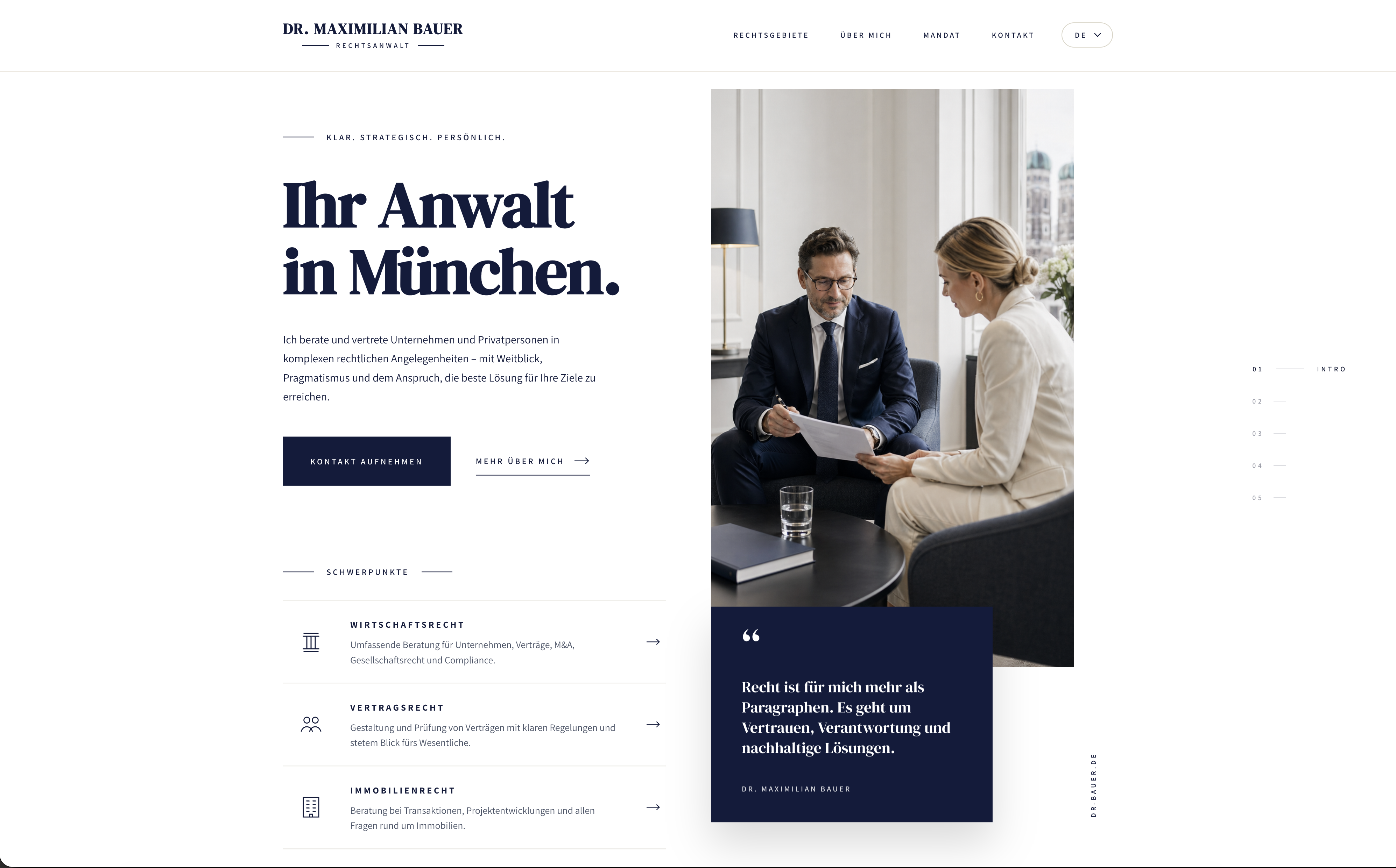
Creating a law firm page
For this one I picked an example of a style I wasn't working with before: a nice editorial, asymmetric page for a lawyer. It may seem AI can "one-shot" these and it truly can, but my goal is to push it to the next level. Here's the screenshot of the style we're starting with.
Initial version
Initial version it came up with. Decent, but generic. The AI defaulted to safe layout choices.
Style correction prompt
Now applying the style correction prompt. After the first prompt, the result is way closer to the original screenshot.
Layout + missing elements
Layout prompt + pointing out what the LLM had missed (elements on the left). Hint: AI cannot generate logos, and SVG figures it generates are always meh, so I'm leaving that part for later.
About section
Now the next section: the "about us". Asking the AI to use the existing Hero as the style reference.
New layout iteration
The next section had too many copied bits from the previous one, so I asked the AI to actually invent a new layout in a new iteration.
Services section
Now onto the "services" section, using this prompt:
And basically I just continue the loop. Asking for a new section, then style check, then layout, then one or two corrections, and onto the next one until it's done.
Prompting the settings
What I would do very frequently is, instead of re-prompting a dozen times something I don't like (an element or a layout), I'd ask the AI to give me all the possible settings for this block or element and simply tweak it to my liking. This is where Onepage is really different from any coding tool.
You can and should ask it to add more settings.
Like here, for example: I asked it for a 9:16 image and for some reason it still appeared too tall.
So I asked the AI to give me complete control over it via settings, and simply tweaked the ratio myself.
Final polish
Now, here's how my final result looks like, and as you can see it's pretty static, so let's turn it into something beautiful.
Everyone has seen those beautiful websites (especially showcased on Twitter) that are supposedly "made with AI". While it's true, it requires a ton of work and it's not as easy as many of those people claim. The key is always assets and libraries.
What is a library? Something Onepage AI can connect to your website with ready-made effects. There are libraries for many things (charts, background effects, general animators) and you'll always win big if you can tell the AI to connect a certain library, or ASK the AI which library it can use.
Let's do exactly that.
With overall effects, there's no cheatsheet aside from this: you have to be able to explain desired effects with human knowledge after the libraries are picked. I went for the "layered" and "parallax" effects and started applying an "orchestrated sequence" for the hero section.
A library shortlist
Most of the "how is this even a website" pages you've seen on Twitter are not pure CSS. They lean on a small set of libraries that solve the hard parts: smooth scroll, sequenced timelines, GPU-driven visuals, physics, maps, charts, proper icons. Below is a shortlist of what the good ones tend to use, with a starter prompt for each.
A heads-up before you copy-paste: not all of these are wired into Onepage AI yet, but most are. A few of the heavier ones (raw WebGL shaders, physics, custom map styles) may need a manual setup or a follow-up prompt or two. Support is rolling out continuously.
01 GSAP + ScrollTrigger
The animation engine of the modern web
Industry-standard timeline animation library. Pairs with ScrollTrigger for scroll-driven scenes, pinning, scrubbing, and complex sequencing. Free for commercial use since 2024. If you've watched a section pin, scrub, and reveal step by step on a polished site, it's almost certainly this.
Spotted onApple product pages, Stripe, the majority of Awwwards Site of the Month winners
Starter promptConnect GSAP and ScrollTrigger to this section. Build a scroll-driven timeline that pins the section, animates each element in sequence as the user scrolls through it, then unpins cleanly after the last keyframe. Keep the timing tasteful and easings soft.
02 Raw WebGL (OGL)
GPU visuals without the bloat
Direct WebGL via a tiny wrapper like OGL, or hand-written shaders on a canvas. The lighter, more reliable path to custom shaders, distortion fields, particle clouds, and gradient meshes than full 3D engines. If you want the visual without the framework weight, this is the route.
Spotted onAwwwards hero backgrounds, agency sites, editorial experimentals
Starter promptAdd a raw WebGL canvas as a full-bleed background for this section using OGL or a plain WebGL2 context. Render a slowly animated fragment shader (a flowing noise gradient that drifts with mouse position). Cap device pixel ratio at 1.5 and pause the render loop when the section is offscreen.
03 Framer Motion (Motion)
Motion for React
Declarative animation API for React components. Best in class for layout transitions, gestures, shared element animations, and viewport-triggered reveals. Recently rebranded as just "Motion" with a hardware-accelerated successor.
Spotted onVercel, Linear, most modern SaaS marketing pages
Starter promptUse Framer Motion to add staggered fade-up entrance animations to the items in this section. Trigger them once when entering the viewport using whileInView with viewport.once true. Stagger children by 80ms and use a soft spring on the parent.
04 Lenis
Smooth scroll, done right
Studio Freight's smooth-scroll library. Lightweight, framerate-independent, integrates cleanly with ScrollTrigger and CSS scroll-driven animations. The reason almost every Awwwards-grade site in 2024 has that buttery scroll feel.
Spotted onstudiofreight.com, awwwards.com itself, dozens of Site of the Month winners
Starter promptAdd Lenis smooth scrolling to the entire page. Use a duration around 1.2 seconds with a soft cubic easing. Make sure it syncs with any existing ScrollTrigger animations and degrades gracefully on touch devices.
05 PixiJS
2D WebGL, blazingly fast
Hardware-accelerated 2D rendering. Used for image distortions, displacement effects, particle systems, and interactive backgrounds where a full 3D engine would be overkill. Pairs well with shaders for editorial image effects.
Spotted onAwwwards image-effect heroes, news experimentals, music album sites
Starter promptAdd a PixiJS displacement effect to the hero image. Use a noise displacement map that intensifies on mouse hover and idles back when the cursor leaves. Keep the original image as an accessible img tag underneath.
06 Cobe
The interactive globe everyone uses
Tiny WebGL globe library (~5kb) that powers the spinning earth you've seen on every modern dev-tool homepage. Pure canvas, no Three.js, no bloat. Drop it in a hero and pin markers, animate rotation, hook scroll progress to camera. The single fastest way to add something visual that feels expensive.
Spotted onStripe, Linear, GitHub, Resend, Cal.com, basically every YC homepage in 2024
Starter promptAdd a Cobe interactive globe to this section as the hero visual. Style it with this page's accent color for the markers and a soft monochrome base sphere. Auto-rotate slowly when idle, slow down on mouse hover, and pin a few markers at city coordinates.
07 react-fast-marquee
Infinite scrolling rows, done right
The infinite logo strips, ticker tapes, and edge-to-edge headlines you see on every Awwwards homepage in 2024. Hardware-accelerated, pause on hover, gradient masks at the edges, two-direction support. Cleaner and more reliable than rolling your own CSS keyframes.
Spotted onModern SaaS logo strips, agency portfolios, fashion and editorial sites, indie launches
Starter promptReplace this static row with a react-fast-marquee component. Loop the items horizontally at a slow speed, pause on hover, add gradient fade masks on the left and right edges, and duplicate the items so the loop reads as continuous. Match the page's text and accent colors.
08 SplitType
Split text into chars, words, lines
Tiny utility that wraps every character, word, or line of a heading in its own span. The companion to GSAP for kinetic typography. If you've seen a hero where letters rise, fade, or stagger in one by one, SplitType (or its predecessor Splitting.js) is doing the wrapping. Saves you from writing fragile manual wrappers by hand.
Spotted onAwwwards SOTM heroes, agency portfolios, modern editorial homepages
Starter promptUse SplitType to split the main heading in this section into individual characters. Then animate each char with GSAP: a fade-in plus 12px rise, staggered by 30ms, triggered when the heading enters the viewport. Preserve accessibility by keeping the original text in an aria-label on the parent.
09 Embla Carousel
The modern carousel
Tiny, dependency-free, swipe-aware carousel with first-class React support. Has quietly replaced Swiper as the default choice for most modern sites. Composable through plugins (autoplay, parallax, wheel gestures).
Spotted onLinear, Vercel, modern e-commerce, design system docs
Starter promptReplace this static row with an Embla Carousel. Enable drag scrolling, snap-aligned slides, and add subtle horizontal parallax to the slide content based on Embla's scroll progress events.
10 MapLibre GL
Real maps, on your terms
Open-source WebGL map renderer (a free fork of Mapbox GL). Beats embedded Google Maps iframes in every way: vector tiles, custom styling, smooth pan and zoom, animated camera flights, 3D terrain. Use it any time the AI tries to give you a static map screenshot.
Spotted onStripe Atlas, Strava, modern travel and logistics startups
Starter promptReplace the static map placeholder with a MapLibre GL map. Use a minimal monochrome style that matches this page's palette, add a single pin at the office location, and animate a slow camera fly-to on viewport entry. Disable scroll-zoom by default; require a click to interact.
11 Rough.js
Make anything look hand-drawn
Tiny library that renders shapes, lines, and SVG paths in a sketchy, hand-drawn style. The engine inside Excalidraw. The single best antidote to LLM-generated SVGs that always look stiff and generic. Great for charts, diagrams, decorative borders, and giving editorial sites a human, illustrated feel.
Spotted onExcalidraw, hand-drawn explainer sites, indie product docs, conference microsites
Starter promptUse Rough.js to convert the decorative shapes and dividers in this section into hand-drawn versions. Use a 1.5px stroke, mild roughness around 1.2, and the page's text color. Keep semantic SVG underneath for accessibility; only the rendered look should be sketchy.
12 Vivus
SVG paths that draw themselves
The classic library for animating SVG paths as if a pen were drawing them in real time. Pair with any line-art logo, signature, icon, or illustration to get the iconic self-drawing reveal that AI cannot fake with motion alone. Tiny, dependency-free, works with any SVG.
Spotted onAgency intros, signature reveals, logo loaders, kinetic illustration sites
Starter promptTake the SVG illustration in this section and animate it with Vivus using the 'sync' style so all paths draw at once over 1.4s. Trigger the animation when the illustration enters the viewport. Use the page's text color for the stroke and 1.25px width.
13 Two.js
Programmatic vector scene-building
A 2D drawing API for composing shapes, paths, and groups into figures programmatically, rendering to SVG, canvas, or WebGL from the same code. Use it when you want a generative illustration or animated diagram and don't trust the LLM to author the geometry by hand. Cleaner than Paper.js and more focused than Pixi.
Spotted onGenerative art portfolios, interactive explainers, custom data viz, motion-design sites
Starter promptUse Two.js to build the abstract illustration in this section programmatically: a grid of evenly spaced circles, each with a slight random offset, slowly drifting. Render to SVG so it stays crisp at any size, and use the page's accent color with a 60% opacity fill.
14 Recharts
Composable React charts
The default charting library for React in 2024. Built on D3, but with a clean component API. Use it whenever the AI generates a fake chart as an SVG illustration: real data, real responsiveness, real animation, with maybe 30 lines of code.
Spotted onVercel dashboards, Linear, fintech and analytics startups
Starter promptReplace this static chart illustration with a real Recharts area chart. Accept the data via a settings array. Style it with this page's accent color, soft grid lines, and a smooth monotone curve. Add a simple tooltip on hover.
15 Leaflet + OpenStreetMap
The classic, zero-config map
Leaflet is the lightweight, battle-tested map library that pairs with free OpenStreetMap tiles. No API keys, no billing, no signup. Pick this over MapLibre when you don't need vector tiles or 3D camera tricks and just want a real map on the page in 20 lines of code.
Spotted onWikipedia, OSM itself, indie tools, open-data sites, government portals
Starter promptAdd a Leaflet map to this section using free OpenStreetMap tiles (no API key needed). Center it on the office location, drop a single marker with a popup, and use the standard OSM tile layer. Disable scroll-zoom by default; require a click before the map captures wheel events.
You don't need to know the internals. You need to know which tool fits the moment, and ask the AI to wire it up. Half the work of a memorable page is just making the right pick from this list.
There's also many more libraries out there on the web that you can explore